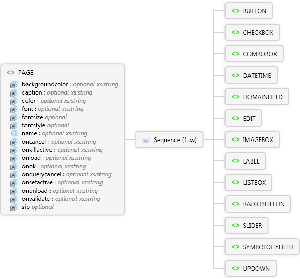
<xs:element name="PAGE" xmlns:xs="http://www.w3.org/2001/XMLSchema">
<xs:annotation>
<xs:documentation>Used to define a page of an ArcPad form.</xs:documentation>
</xs:annotation>
<xs:complexType>
<xs:sequence maxOccurs="unbounded">
<xs:element name="BUTTON" maxOccurs="1">
<xs:annotation>
<xs:documentation>Used to define a Button control in a form.</xs:documentation>
</xs:annotation>
<xs:complexType>
<xs:attribute ref="height" use="required" />
<xs:attribute ref="width" use="required" />
<xs:attribute use="required" name="x" type="xs:int" />
<xs:attribute use="required" name="y" type="xs:int" />
<xs:attribute ref="alignment" />
<xs:attribute ref="backgroundcolor">
<xs:annotation>
<xs:documentation>The background color to use for the button. If not specified, this value is inherited from the page's backgroundcolor attribute.</xs:documentation>
</xs:annotation>
</xs:attribute>
<xs:attribute ref="border" />
<xs:attribute ref="caption">
<xs:annotation>
<xs:documentation>The text appearing in the button.</xs:documentation>
</xs:annotation>
</xs:attribute>
<xs:attribute ref="color">
<xs:annotation>
<xs:documentation>The color to use for the button's text. If not specified, this value is inherited from the page's color attribute.</xs:documentation>
</xs:annotation>
</xs:attribute>
<xs:attribute ref="font">
<xs:annotation>
<xs:documentation>The font to use for the button's text. If not specified, this value is inherited from the page's font attribute.</xs:documentation>
</xs:annotation>
</xs:attribute>
<xs:attribute ref="fontsize">
<xs:annotation>
<xs:documentation>The font size to use for the button's text. If not specified, this value is inherited from the page's fontsize attribute.</xs:documentation>
</xs:annotation>
</xs:attribute>
<xs:attribute default="regular" ref="fontstyle">
<xs:annotation>
<xs:documentation>The font style to use for the button's text. If not specified, this value is inherited from the page's fontstyle attribute. If the value is not regular, it can be any combination of other values, expressed as a comma delimited list (for example, fontstyle="bold,underline").</xs:documentation>
</xs:annotation>
</xs:attribute>
<xs:attribute ref="group" />
<xs:attribute ref="name">
<xs:annotation>
<xs:documentation>Name of the Button control. Used to reference the control in scripts</xs:documentation>
</xs:annotation>
</xs:attribute>
<xs:attribute ref="onclick" />
<xs:attribute ref="onkillfocus" />
<xs:attribute ref="onsetfocus" />
<xs:attribute ref="tabstop" />
</xs:complexType>
</xs:element>
<xs:element name="CHECKBOX" maxOccurs="1">
<xs:annotation>
<xs:documentation>Used to define a CheckBox control in a form.</xs:documentation>
</xs:annotation>
<xs:complexType>
<xs:attribute use="required" ref="height">
<xs:annotation>
<xs:documentation>The height of the check box.</xs:documentation>
</xs:annotation>
</xs:attribute>
<xs:attribute use="required" ref="width">
<xs:annotation>
<xs:documentation>The width of the check box.</xs:documentation>
</xs:annotation>
</xs:attribute>
<xs:attribute use="required" name="x" type="xs:int">
<xs:annotation>
<xs:documentation>The x coordinate of the upper left corner of the check box.</xs:documentation>
</xs:annotation>
</xs:attribute>
<xs:attribute use="required" name="y" type="xs:int">
<xs:annotation>
<xs:documentation>The y coordinate of the upper left corner of the check box</xs:documentation>
</xs:annotation>
</xs:attribute>
<xs:attribute default="left" ref="alignment">
<xs:annotation>
<xs:documentation>The alignment of the check box's text.</xs:documentation>
</xs:annotation>
</xs:attribute>
<xs:attribute ref="backgroundcolor">
<xs:annotation>
<xs:documentation>The background color to use for the check box. If not specified, this value is inherited from the page's backgroundcolor attribute.</xs:documentation>
</xs:annotation>
</xs:attribute>
<xs:attribute default="false" ref="border">
<xs:annotation>
<xs:documentation>Specifies whether the check box has a border.</xs:documentation>
</xs:annotation>
</xs:attribute>
<xs:attribute ref="caption">
<xs:annotation>
<xs:documentation>The caption displayed to the right of the check box.</xs:documentation>
</xs:annotation>
</xs:attribute>
<xs:attribute ref="color">
<xs:annotation>
<xs:documentation>The color to use for the check box's text. If not specified, this value is inherited from the page's color attribute.</xs:documentation>
</xs:annotation>
</xs:attribute>
<xs:attribute ref="defaultvalue" />
<xs:attribute ref="field" />
<xs:attribute ref="font">
<xs:annotation>
<xs:documentation>The font to use for the check box's text. If not specified, this value is inherited from the page's font attribute.</xs:documentation>
</xs:annotation>
</xs:attribute>
<xs:attribute ref="fontsize">
<xs:annotation>
<xs:documentation>The font size to use for the check box's text. If not specified, this value is inherited from the page's fontsize attribute.</xs:documentation>
</xs:annotation>
</xs:attribute>
<xs:attribute default="regular" ref="fontstyle">
<xs:annotation>
<xs:documentation>The font style to use for the check box's text. If not specified, this value is inherited from the page's fontstyle attribute. If the value is not regular, it can be any combination of other values, expressed as a comma delimited list (for example, fontstyle="bold,underline").</xs:documentation>
</xs:annotation>
</xs:attribute>
<xs:attribute default="false" ref="group">
<xs:annotation>
<xs:documentation>Specifies whether the check box starts a new group of controls.</xs:documentation>
</xs:annotation>
</xs:attribute>
<xs:attribute ref="name">
<xs:annotation>
<xs:documentation>Name of the CheckBox control. Used to reference the control in scripts.</xs:documentation>
</xs:annotation>
</xs:attribute>
<xs:attribute ref="onclick">
<xs:annotation>
<xs:documentation>Specify the script to run when this event occurs.</xs:documentation>
</xs:annotation>
</xs:attribute>
<xs:attribute ref="onkillfocus">
<xs:annotation>
<xs:documentation>Specify the script to run when this event occurs.</xs:documentation>
</xs:annotation>
</xs:attribute>
<xs:attribute ref="onsetfocus">
<xs:annotation>
<xs:documentation>Specify the script to run when this event occurs.</xs:documentation>
</xs:annotation>
</xs:attribute>
<xs:attribute ref="onvalidate">
<xs:annotation>
<xs:documentation>Specify the script to run when this event occurs.</xs:documentation>
</xs:annotation>
</xs:attribute>
<xs:attribute ref="readonly" />
<xs:attribute ref="required" />
<xs:attribute default="true" ref="tabstop">
<xs:annotation>
<xs:documentation>Specifies whether the TAB key can be used to move the focus to the check box.</xs:documentation>
</xs:annotation>
</xs:attribute>
</xs:complexType>
</xs:element>
<xs:element name="COMBOBOX" maxOccurs="1">
<xs:annotation>
<xs:documentation>Used to define a ComboBox control in a form.</xs:documentation>
</xs:annotation>
<xs:complexType>
<xs:sequence>
<xs:element ref="LISTITEM" maxOccurs="unbounded" />
</xs:sequence>
<xs:attribute use="required" ref="height">
<xs:annotation>
<xs:documentation>The height of the combo box.</xs:documentation>
</xs:annotation>
</xs:attribute>
<xs:attribute use="required" ref="width">
<xs:annotation>
<xs:documentation>The width of the combo box.</xs:documentation>
</xs:annotation>
</xs:attribute>
<xs:attribute use="required" name="x" type="xs:int">
<xs:annotation>
<xs:documentation>The x coordinate of the upper left corner of the combo box.</xs:documentation>
</xs:annotation>
</xs:attribute>
<xs:attribute use="required" name="y" type="xs:gYearMonth">
<xs:annotation>
<xs:documentation>The y coordinate of the upper left corner of the combo box</xs:documentation>
</xs:annotation>
</xs:attribute>
<xs:attribute ref="backgroundcolor">
<xs:annotation>
<xs:documentation>The background color to use for the combo box. If not specified, this value is inherited from the page's backgroundcolor attribute.</xs:documentation>
</xs:annotation>
</xs:attribute>
<xs:attribute default="false" ref="border">
<xs:annotation>
<xs:documentation>Specifies whether the combo box has a border.</xs:documentation>
</xs:annotation>
</xs:attribute>
<xs:attribute ref="color">
<xs:annotation>
<xs:documentation>The color to use for the combo box's text. If not specified, this value is inherited from the page's color attribute.</xs:documentation>
</xs:annotation>
</xs:attribute>
<xs:attribute ref="defaultvalue">
<xs:annotation>
<xs:documentation>A simple expression that specifies the default value of the combo box.</xs:documentation>
</xs:annotation>
</xs:attribute>
<xs:attribute ref="field">
<xs:annotation>
<xs:documentation>The field of the shapefile's DBF table that is linked to the combo box.</xs:documentation>
</xs:annotation>
</xs:attribute>
<xs:attribute ref="font">
<xs:annotation>
<xs:documentation>The font to use for the combo box's text. If not specified, this value is inherited from the page's font attribute.</xs:documentation>
</xs:annotation>
</xs:attribute>
<xs:attribute ref="fontsize">
<xs:annotation>
<xs:documentation>The font size to use for the combo box's text. If not specified, this value is inherited from the page's fontsize attribute.</xs:documentation>
</xs:annotation>
</xs:attribute>
<xs:attribute default="regular" ref="fontstyle">
<xs:annotation>
<xs:documentation>The font style to use for the combo box's text. If not specified, this value is inherited from the page's fontstyle attribute. If the value is not regular, it can be any combination of other values, expressed as a comma delimited list (for example, fontstyle="bold,underline").</xs:documentation>
</xs:annotation>
</xs:attribute>
<xs:attribute default="false" ref="group">
<xs:annotation>
<xs:documentation>Specifies whether the combo box starts a new group of controls.</xs:documentation>
</xs:annotation>
</xs:attribute>
<xs:attribute ref="limittolist" />
<xs:attribute ref="listtable" />
<xs:attribute ref="listtextfield" />
<xs:attribute ref="listvaluefield" />
<xs:attribute ref="maxvalue" />
<xs:attribute ref="name" />
<xs:attribute ref="onchange" />
<xs:attribute ref="oncloseup" />
<xs:attribute ref="ondropdown" />
<xs:attribute ref="onkillfocus">
<xs:annotation>
<xs:documentation>Specify the script to run when this event occurs.</xs:documentation>
</xs:annotation>
</xs:attribute>
<xs:attribute ref="onselcancel" />
<xs:attribute ref="onselchange" />
<xs:attribute ref="onselok" />
<xs:attribute ref="onsetfocus">
<xs:annotation>
<xs:documentation>Specify the script to run when this event occurs.</xs:documentation>
</xs:annotation>
</xs:attribute>
<xs:attribute ref="onvalidate">
<xs:annotation>
<xs:documentation>Specify the script to run when this event occurs.</xs:documentation>
</xs:annotation>
</xs:attribute>
<xs:attribute default="false" ref="readonly">
<xs:annotation>
<xs:documentation>Specifies whether the combo box's value can be modified by the user.</xs:documentation>
</xs:annotation>
</xs:attribute>
<xs:attribute default="false" ref="required">
<xs:annotation>
<xs:documentation>Specifies if the user must enter some text in the combo box.</xs:documentation>
</xs:annotation>
</xs:attribute>
<xs:attribute default="true" ref="sip" />
<xs:attribute ref="sort" />
<xs:attribute default="true" ref="tabstop">
<xs:annotation>
<xs:documentation>Specifies whether the TAB key can be used to move the focus to the combo box.</xs:documentation>
</xs:annotation>
</xs:attribute>
</xs:complexType>
</xs:element>
<xs:element name="DATETIME" maxOccurs="1">
<xs:annotation>
<xs:documentation>Used to define a DateTime control in a form.</xs:documentation>
</xs:annotation>
<xs:complexType>
<xs:attribute use="required" ref="height">
<xs:annotation>
<xs:documentation>The height of the control.</xs:documentation>
</xs:annotation>
</xs:attribute>
<xs:attribute use="required" ref="width">
<xs:annotation>
<xs:documentation>The width of the control</xs:documentation>
</xs:annotation>
</xs:attribute>
<xs:attribute use="required" name="x" type="xs:int">
<xs:annotation>
<xs:documentation>The x coordinate of the upper left corner of the control</xs:documentation>
</xs:annotation>
</xs:attribute>
<xs:attribute use="required" name="y" type="xs:int">
<xs:annotation>
<xs:documentation>The y coordinate of the upper left corner of the conrol</xs:documentation>
</xs:annotation>
</xs:attribute>
<xs:attribute default="false" ref="allownulls" />
<xs:attribute ref="backgroundcolor">
<xs:annotation>
<xs:documentation>The background color to use for the control. If not specified, this value is inherited from the page's backgroundcolor attribute.</xs:documentation>
</xs:annotation>
</xs:attribute>
<xs:attribute default="false" ref="border">
<xs:annotation>
<xs:documentation>Specifies whether the control has a border.</xs:documentation>
</xs:annotation>
</xs:attribute>
<xs:attribute ref="color">
<xs:annotation>
<xs:documentation>The color to use for the controls text. If not specified, this value is inherited from the page's color attribute.</xs:documentation>
</xs:annotation>
</xs:attribute>
<xs:attribute ref="defaultvalue">
<xs:annotation>
<xs:documentation>A simple expression that specifies the default value of the control.</xs:documentation>
</xs:annotation>
</xs:attribute>
<xs:attribute ref="field">
<xs:annotation>
<xs:documentation>The field of the shapefile's DBF table that is linked to the control.</xs:documentation>
</xs:annotation>
</xs:attribute>
<xs:attribute ref="font">
<xs:annotation>
<xs:documentation>The font to use for the control's text. If not specified, this value is inherited from the page's font attribute.</xs:documentation>
</xs:annotation>
</xs:attribute>
<xs:attribute ref="fontsize">
<xs:annotation>
<xs:documentation>The font size to use for the control's text. If not specified, this value is inherited from the page's fontsize attribute.</xs:documentation>
</xs:annotation>
</xs:attribute>
<xs:attribute default="regular" ref="fontstyle">
<xs:annotation>
<xs:documentation>The font style to use for the control's text. If not specified, this value is inherited from the page's fontstyle attribute. If the value is not regular, it can be any combination of other values, expressed as a comma delimited list (for example, fontstyle="bold,underline").</xs:documentation>
</xs:annotation>
</xs:attribute>
<xs:attribute default="false" ref="group">
<xs:annotation>
<xs:documentation>Specifies whether the control starts a new group of controls.</xs:documentation>
</xs:annotation>
</xs:attribute>
<xs:attribute ref="name">
<xs:annotation>
<xs:documentation>Name of the DateTime control. Used to reference the control in scripts.</xs:documentation>
</xs:annotation>
</xs:attribute>
<xs:attribute ref="onchange">
<xs:annotation>
<xs:documentation>Specify the script to run when this event occurs.</xs:documentation>
</xs:annotation>
</xs:attribute>
<xs:attribute ref="oncloseup">
<xs:annotation>
<xs:documentation>Specify the script to run when this event occurs.</xs:documentation>
</xs:annotation>
</xs:attribute>
<xs:attribute ref="ondropdown">
<xs:annotation>
<xs:documentation>Specify the script to run when this event occurs.</xs:documentation>
</xs:annotation>
</xs:attribute>
<xs:attribute ref="onkillfocus">
<xs:annotation>
<xs:documentation>Specify the script to run when this event occurs.</xs:documentation>
</xs:annotation>
</xs:attribute>
<xs:attribute ref="onsetfocus">
<xs:annotation>
<xs:documentation>Specify the script to run when this event occurs.</xs:documentation>
</xs:annotation>
</xs:attribute>
<xs:attribute ref="onvalidate">
<xs:annotation>
<xs:documentation>Specify the script to run when this event occurs.</xs:documentation>
</xs:annotation>
</xs:attribute>
<xs:attribute default="false" ref="readonly">
<xs:annotation>
<xs:documentation>Specifies whether the control's value can be modified by the user.</xs:documentation>
</xs:annotation>
</xs:attribute>
<xs:attribute default="false" ref="required">
<xs:annotation>
<xs:documentation>Specifies if the user must enter some text in the control</xs:documentation>
</xs:annotation>
</xs:attribute>
<xs:attribute default="auto" ref="sip">
<xs:annotation>
<xs:documentation>Specifies if the SIP (soft input panel) is displayed on pen devices when the control gets the focus.</xs:documentation>
</xs:annotation>
</xs:attribute>
<xs:attribute default="true" ref="tabstop">
<xs:annotation>
<xs:documentation>Specifies whether the TAB key can be used to move the focus to the control.</xs:documentation>
</xs:annotation>
</xs:attribute>
</xs:complexType>
</xs:element>
<xs:element name="DOMAINFIELD" maxOccurs="1">
<xs:annotation>
<xs:documentation>Used to define a 'domain field' control in a form. This is a special control that is tied to a domain or subtype field in a layer form.</xs:documentation>
</xs:annotation>
<xs:complexType />
</xs:element>
<xs:element name="EDIT" maxOccurs="1">
<xs:annotation>
<xs:documentation>Used to define an Edit control in a form.</xs:documentation>
</xs:annotation>
<xs:complexType>
<xs:attribute use="required" ref="height">
<xs:annotation>
<xs:documentation>The height of the text box.</xs:documentation>
</xs:annotation>
</xs:attribute>
<xs:attribute use="required" ref="width">
<xs:annotation>
<xs:documentation>The width of the text box.</xs:documentation>
</xs:annotation>
</xs:attribute>
<xs:attribute use="required" name="x" type="xs:int">
<xs:annotation>
<xs:documentation>The x coordinate of the upper left corner of the text box.</xs:documentation>
</xs:annotation>
</xs:attribute>
<xs:attribute use="required" name="y" type="xs:int">
<xs:annotation>
<xs:documentation>The y coordinate of the upper left corner of the text box</xs:documentation>
</xs:annotation>
</xs:attribute>
<xs:attribute default="left" ref="alignment">
<xs:annotation>
<xs:documentation>The alignment of the text box's text.</xs:documentation>
</xs:annotation>
</xs:attribute>
<xs:attribute ref="autoincrement" />
<xs:attribute ref="autoincrementstep" />
<xs:attribute ref="backgroundcolor">
<xs:annotation>
<xs:documentation>The background color to use for the text box. If not specified, this value is inherited from the page's backgroundcolor attribute.</xs:documentation>
</xs:annotation>
</xs:attribute>
<xs:attribute default="true" ref="border">
<xs:annotation>
<xs:documentation>Specifies whether the text box has a border.</xs:documentation>
</xs:annotation>
</xs:attribute>
<xs:attribute ref="color">
<xs:annotation>
<xs:documentation>The color to use for the text box's text. If not specified, this value is inherited from the page's color attribute.</xs:documentation>
</xs:annotation>
</xs:attribute>
<xs:attribute ref="defaultvalue">
<xs:annotation>
<xs:documentation>A simple expression that specifies the default value of the text box.</xs:documentation>
</xs:annotation>
</xs:attribute>
<xs:attribute ref="field">
<xs:annotation>
<xs:documentation>The field of the shapefile's DBF table that is linked to the text box.</xs:documentation>
</xs:annotation>
</xs:attribute>
<xs:attribute ref="font">
<xs:annotation>
<xs:documentation>The font to use for the text box's text. If not specified, this value is inherited from the page's font attribute.</xs:documentation>
</xs:annotation>
</xs:attribute>
<xs:attribute ref="fontsize">
<xs:annotation>
<xs:documentation>The font size to use for the text box's text. If not specified, this value is inherited from the page's fontsize attribute.</xs:documentation>
</xs:annotation>
</xs:attribute>
<xs:attribute default="regular" ref="fontstyle">
<xs:annotation>
<xs:documentation>The font style to use for the text box's text. If not specified, this value is inherited from the page's fontstyle attribute. If the value is not regular, it can be any combination of other values, expressed as a comma delimited list (for example, fontstyle="bold,underline").</xs:documentation>
</xs:annotation>
</xs:attribute>
<xs:attribute default="false" ref="group">
<xs:annotation>
<xs:documentation>Specifies whether the text box starts a new group of controls.</xs:documentation>
</xs:annotation>
</xs:attribute>
<xs:attribute ref="hscroll" />
<xs:attribute ref="lowercase" />
<xs:attribute ref="maxvalue">
<xs:annotation>
<xs:documentation>Specifies the maximum value allowed for the control. This can be a numeric or text value.</xs:documentation>
</xs:annotation>
</xs:attribute>
<xs:attribute ref="minvalue" />
<xs:attribute ref="multiline" />
<xs:attribute ref="name">
<xs:annotation>
<xs:documentation>Name of the Edit control. Used to reference the control in scripts.</xs:documentation>
</xs:annotation>
</xs:attribute>
<xs:attribute ref="onchange">
<xs:annotation>
<xs:documentation>Specify the script to run when this event occurs.</xs:documentation>
</xs:annotation>
</xs:attribute>
<xs:attribute ref="onkillfocus">
<xs:annotation>
<xs:documentation>Specify the script to run when this event occurs.</xs:documentation>
</xs:annotation>
</xs:attribute>
<xs:attribute ref="onsetfocus">
<xs:annotation>
<xs:documentation>Specify the script to run when this event occurs.</xs:documentation>
</xs:annotation>
</xs:attribute>
<xs:attribute ref="onvalidate">
<xs:annotation>
<xs:documentation>Specify the script to run when this event occurs.</xs:documentation>
</xs:annotation>
</xs:attribute>
<xs:attribute ref="password" />
<xs:attribute default="false" ref="readonly">
<xs:annotation>
<xs:documentation>Specifies whether the text box's value can be modified by the user.</xs:documentation>
</xs:annotation>
</xs:attribute>
<xs:attribute default="false" ref="required">
<xs:annotation>
<xs:documentation>Specifies if the user must enter some text in the text box.</xs:documentation>
</xs:annotation>
</xs:attribute>
<xs:attribute default="auto" ref="sip">
<xs:annotation>
<xs:documentation>Specifies if the SIP (soft input panel) is displayed on pen devices when the text box gets the focus.</xs:documentation>
</xs:annotation>
</xs:attribute>
<xs:attribute default="true" ref="tabstop">
<xs:annotation>
<xs:documentation>Specifies whether the TAB key can be used to move the focus to the text box.</xs:documentation>
</xs:annotation>
</xs:attribute>
<xs:attribute ref="uppercase" />
<xs:attribute ref="vscroll" />
</xs:complexType>
</xs:element>
<xs:element name="IMAGEBOX" maxOccurs="1">
<xs:annotation>
<xs:documentation>Used to define an ImageBox control in a form.</xs:documentation>
</xs:annotation>
<xs:complexType>
<xs:attribute use="required" ref="height">
<xs:annotation>
<xs:documentation>The height of the image box.</xs:documentation>
</xs:annotation>
</xs:attribute>
<xs:attribute use="required" ref="width">
<xs:annotation>
<xs:documentation>The width of the image box.</xs:documentation>
</xs:annotation>
</xs:attribute>
<xs:attribute use="required" name="x" type="xs:int">
<xs:annotation>
<xs:documentation>The x coordinate of the upper left corner of the image box.</xs:documentation>
</xs:annotation>
</xs:attribute>
<xs:attribute use="required" name="y" type="xs:int">
<xs:annotation>
<xs:documentation>The y coordinate of the upper left corner of the image box</xs:documentation>
</xs:annotation>
</xs:attribute>
<xs:attribute ref="border">
<xs:annotation>
<xs:documentation>Specifies whether the image box has a border.</xs:documentation>
</xs:annotation>
</xs:attribute>
<xs:attribute ref="clickaction" />
<xs:attribute ref="defaultvalue">
<xs:annotation>
<xs:documentation>A simple expression that specifies the default value of the image box.</xs:documentation>
</xs:annotation>
</xs:attribute>
<xs:attribute ref="field">
<xs:annotation>
<xs:documentation>The field of the shapefile's DBF table that is linked to the image box.</xs:documentation>
</xs:annotation>
</xs:attribute>
<xs:attribute ref="group">
<xs:annotation>
<xs:documentation>Specifies whether the image box starts a new group of controls.</xs:documentation>
</xs:annotation>
</xs:attribute>
<xs:attribute ref="name">
<xs:annotation>
<xs:documentation>Name of the ImageBox control. Used to reference the control in scripts.</xs:documentation>
</xs:annotation>
</xs:attribute>
<xs:attribute ref="onchange">
<xs:annotation>
<xs:documentation>Specify the script to run when this event occurs.</xs:documentation>
</xs:annotation>
</xs:attribute>
<xs:attribute ref="onclick">
<xs:annotation>
<xs:documentation>Specify the script to run when this event occurs.</xs:documentation>
</xs:annotation>
</xs:attribute>
<xs:attribute ref="readonly">
<xs:annotation>
<xs:documentation>Specifies whether the image box's value can be modified by the user.</xs:documentation>
</xs:annotation>
</xs:attribute>
<xs:attribute ref="required">
<xs:annotation>
<xs:documentation>Specifies if the user must select an image in the image box.</xs:documentation>
</xs:annotation>
</xs:attribute>
<xs:attribute ref="tabstop">
<xs:annotation>
<xs:documentation>Specifies whether the TAB key can be used to move the focus to the image box.</xs:documentation>
</xs:annotation>
</xs:attribute>
</xs:complexType>
</xs:element>
<xs:element name="LABEL" maxOccurs="1">
<xs:annotation>
<xs:documentation>Used to specify the label font for ArcPad in ArcPadPrefs.apx and to define a Label control in a form.</xs:documentation>
</xs:annotation>
<xs:complexType>
<xs:attribute use="required" ref="height">
<xs:annotation>
<xs:documentation>The height of the label.</xs:documentation>
</xs:annotation>
</xs:attribute>
<xs:attribute use="required" ref="width">
<xs:annotation>
<xs:documentation>The width of the label.</xs:documentation>
</xs:annotation>
</xs:attribute>
<xs:attribute use="required" name="x" type="xs:int">
<xs:annotation>
<xs:documentation>The x coordinate of the upper left corner of the label.</xs:documentation>
</xs:annotation>
</xs:attribute>
<xs:attribute use="required" name="y" type="xs:int">
<xs:annotation>
<xs:documentation>The y coordinate of the upper left corner of the label.</xs:documentation>
</xs:annotation>
</xs:attribute>
<xs:attribute default="left" ref="alignment">
<xs:annotation>
<xs:documentation>The alignment of the label's caption.</xs:documentation>
</xs:annotation>
</xs:attribute>
<xs:attribute ref="backgroundcolor">
<xs:annotation>
<xs:documentation>The background color to use for the label. If not specified, this value is inherited from the page's backgroundcolor attribute.</xs:documentation>
</xs:annotation>
</xs:attribute>
<xs:attribute default="true" ref="border">
<xs:annotation>
<xs:documentation>Specifies whether the label has a border.</xs:documentation>
</xs:annotation>
</xs:attribute>
<xs:attribute ref="caption">
<xs:annotation>
<xs:documentation>The text displayed for the label.</xs:documentation>
</xs:annotation>
</xs:attribute>
<xs:attribute ref="color">
<xs:annotation>
<xs:documentation>The color to use for the label's text. If not specified, this value is inherited from the page's color attribute.</xs:documentation>
</xs:annotation>
</xs:attribute>
<xs:attribute ref="font">
<xs:annotation>
<xs:documentation>The font for the label. If not specified, this value is inherited from the page's font attribute.</xs:documentation>
</xs:annotation>
</xs:attribute>
<xs:attribute ref="fontsize">
<xs:annotation>
<xs:documentation>The font size for the label. If not specified, this value is inherited from the page's fontsize attribute.</xs:documentation>
</xs:annotation>
</xs:attribute>
<xs:attribute default="regular" ref="fontstyle">
<xs:annotation>
<xs:documentation>The font style for the label. If not specified, this value is inherited from the page's fontstyle attribute. If the value is not regular, it can be any combination of other values, expressed as a comma delimited list (for example, fontstyle="bold,underline").</xs:documentation>
</xs:annotation>
</xs:attribute>
<xs:attribute default="false" ref="group">
<xs:annotation>
<xs:documentation>Specifies whether the label starts a new group of controls.</xs:documentation>
</xs:annotation>
</xs:attribute>
<xs:attribute ref="name">
<xs:annotation>
<xs:documentation>The name of the Label control. Used to reference the Label control in scripts.</xs:documentation>
</xs:annotation>
</xs:attribute>
</xs:complexType>
</xs:element>
<xs:element name="LISTBOX" maxOccurs="1">
<xs:annotation>
<xs:documentation>Used to define a ListBox control in a form.</xs:documentation>
</xs:annotation>
<xs:complexType>
<xs:sequence>
<xs:element ref="LISTITEM" maxOccurs="unbounded">
<xs:annotation>
<xs:documentation>Used to define an item in a ComboBox or ListBox form control.</xs:documentation>
</xs:annotation>
</xs:element>
</xs:sequence>
<xs:attribute use="required" ref="height">
<xs:annotation>
<xs:documentation>The height of the list box.</xs:documentation>
</xs:annotation>
</xs:attribute>
<xs:attribute use="required" ref="width">
<xs:annotation>
<xs:documentation>The width of the list box.</xs:documentation>
</xs:annotation>
</xs:attribute>
<xs:attribute use="required" name="x" type="xs:int">
<xs:annotation>
<xs:documentation>The x coordinate of the upper left corner of the list box.</xs:documentation>
</xs:annotation>
</xs:attribute>
<xs:attribute use="required" name="y" type="xs:int">
<xs:annotation>
<xs:documentation>The y coordinate of the upper left corner of the list box</xs:documentation>
</xs:annotation>
</xs:attribute>
<xs:attribute ref="backgroundcolor">
<xs:annotation>
<xs:documentation>The background color to use for the list box. If not specified, this value is inherited from the page's backgroundcolor attribute.</xs:documentation>
</xs:annotation>
</xs:attribute>
<xs:attribute ref="border">
<xs:annotation>
<xs:documentation>Specifies whether the list box has a border.</xs:documentation>
</xs:annotation>
</xs:attribute>
<xs:attribute ref="color">
<xs:annotation>
<xs:documentation>The color to use for the list box's text. If not specified, this value is inherited from the page's color attribute.</xs:documentation>
</xs:annotation>
</xs:attribute>
<xs:attribute ref="defaultvalue">
<xs:annotation>
<xs:documentation>A simple expression that specifies the default value of the combo box.</xs:documentation>
</xs:annotation>
</xs:attribute>
<xs:attribute ref="field">
<xs:annotation>
<xs:documentation>The field of the shapefile's DBF table that is linked to the list box.</xs:documentation>
</xs:annotation>
</xs:attribute>
<xs:attribute ref="font">
<xs:annotation>
<xs:documentation>The font to use for the list box's text. If not specified, this value is inherited from the page's font attribute.</xs:documentation>
</xs:annotation>
</xs:attribute>
<xs:attribute ref="fontsize">
<xs:annotation>
<xs:documentation>The font size to use for the list box's text. If not specified, this value is inherited from the page's fontsize attribute.</xs:documentation>
</xs:annotation>
</xs:attribute>
<xs:attribute default="regular" ref="fontstyle">
<xs:annotation>
<xs:documentation>The font style to use for the list box's text. If not specified, this value is inherited from the page's fontstyle attribute. If the value is not regular, it can be any combination of other values, expressed as a comma delimited list (for example, fontstyle="bold,underline").</xs:documentation>
</xs:annotation>
</xs:attribute>
<xs:attribute ref="group" default="false">
<xs:annotation>
<xs:documentation>Specifies whether the list box starts a new group of controls.</xs:documentation>
</xs:annotation>
</xs:attribute>
<xs:attribute ref="hscroll">
<xs:annotation>
<xs:documentation>Specifies if the list box should have a horizontal scroll bar</xs:documentation>
</xs:annotation>
</xs:attribute>
<xs:attribute ref="listtable">
<xs:annotation>
<xs:documentation>The DBF table used to populate the list box.</xs:documentation>
</xs:annotation>
</xs:attribute>
<xs:attribute ref="listtextfield">
<xs:annotation>
<xs:documentation>The field of the DBF table that contains the data used to populate the text component of the list box's items.</xs:documentation>
</xs:annotation>
</xs:attribute>
<xs:attribute ref="listvaluefield">
<xs:annotation>
<xs:documentation>The field of the DBF table that contains the data used to populate the value component of the list box's items.</xs:documentation>
</xs:annotation>
</xs:attribute>
<xs:attribute ref="name">
<xs:annotation>
<xs:documentation>Name of the ListBox control. Used to reference the control in scripts.</xs:documentation>
</xs:annotation>
</xs:attribute>
<xs:attribute ref="onkillfocus">
<xs:annotation>
<xs:documentation>Specify the script to run when this event occurs.</xs:documentation>
</xs:annotation>
</xs:attribute>
<xs:attribute ref="onselcancel">
<xs:annotation>
<xs:documentation>Specify the script to run when this event occurs.</xs:documentation>
</xs:annotation>
</xs:attribute>
<xs:attribute ref="onselchange">
<xs:annotation>
<xs:documentation>Specify the script to run when this event occurs.</xs:documentation>
</xs:annotation>
</xs:attribute>
<xs:attribute ref="onsetfocus">
<xs:annotation>
<xs:documentation>Specify the script to run when this event occurs.</xs:documentation>
</xs:annotation>
</xs:attribute>
<xs:attribute ref="onvalidate">
<xs:annotation>
<xs:documentation>Specify the script to run when this event occurs.</xs:documentation>
</xs:annotation>
</xs:attribute>
<xs:attribute ref="readonly">
<xs:annotation>
<xs:documentation>Specifies whether the list box's value can be modified by the user.</xs:documentation>
</xs:annotation>
</xs:attribute>
<xs:attribute ref="required">
<xs:annotation>
<xs:documentation>Specifies if the user must enter some text in the list box.</xs:documentation>
</xs:annotation>
</xs:attribute>
<xs:attribute ref="showvalues" />
<xs:attribute ref="sort">
<xs:annotation>
<xs:documentation>Specifies if the items in the list box are automatically sorted alphabetically.</xs:documentation>
</xs:annotation>
</xs:attribute>
<xs:attribute ref="tabstop">
<xs:annotation>
<xs:documentation>Specifies if the items in the list box are automatically sorted alphabetically.</xs:documentation>
</xs:annotation>
</xs:attribute>
<xs:attribute ref="vscroll">
<xs:annotation>
<xs:documentation>Specifies if the list box should have a vertical scroll bar</xs:documentation>
</xs:annotation>
</xs:attribute>
</xs:complexType>
</xs:element>
<xs:element name="RADIOBUTTON" maxOccurs="1">
<xs:annotation>
<xs:documentation>Used to define a RadioButton control in a form.</xs:documentation>
</xs:annotation>
<xs:complexType>
<xs:attribute use="required" ref="height">
<xs:annotation>
<xs:documentation>The height of the radio button.</xs:documentation>
</xs:annotation>
</xs:attribute>
<xs:attribute use="required" ref="width">
<xs:annotation>
<xs:documentation>The width of the radio button.</xs:documentation>
</xs:annotation>
</xs:attribute>
<xs:attribute use="required" name="x" type="xs:int">
<xs:annotation>
<xs:documentation>The x coordinate of the upper left corner of the radio button.</xs:documentation>
</xs:annotation>
</xs:attribute>
<xs:attribute use="required" name="y" type="xs:int">
<xs:annotation>
<xs:documentation>The y coordinate of the upper left corner of the radio button</xs:documentation>
</xs:annotation>
</xs:attribute>
<xs:attribute ref="backgroundcolor">
<xs:annotation>
<xs:documentation>The background color to use for the radio button. If not specified, this value is inherited from the page's backgroundcolor attribute.</xs:documentation>
</xs:annotation>
</xs:attribute>
<xs:attribute default="false" ref="border">
<xs:annotation>
<xs:documentation>Specifies whether the radio button has a border.</xs:documentation>
</xs:annotation>
</xs:attribute>
<xs:attribute ref="caption">
<xs:annotation>
<xs:documentation>The caption displayed to the right of the radio button.</xs:documentation>
</xs:annotation>
</xs:attribute>
<xs:attribute ref="color">
<xs:annotation>
<xs:documentation>The color to use for the radio button's text. If not specified, this value is inherited from the page's color attribute.</xs:documentation>
</xs:annotation>
</xs:attribute>
<xs:attribute ref="field">
<xs:annotation>
<xs:documentation>The field of the shapefile's DBF table that is linked to the radio button.</xs:documentation>
</xs:annotation>
</xs:attribute>
<xs:attribute ref="font">
<xs:annotation>
<xs:documentation>The font to use for the radio button's text. If not specified, this value is inherited from the page's font attribute.</xs:documentation>
</xs:annotation>
</xs:attribute>
<xs:attribute ref="fontsize">
<xs:annotation>
<xs:documentation>The font size to use for the radio button's text. If not specified, this value is inherited from the page's fontsize attribute.</xs:documentation>
</xs:annotation>
</xs:attribute>
<xs:attribute default="regular" ref="fontstyle">
<xs:annotation>
<xs:documentation>The font style to use for the radio button's text. If not specified, this value is inherited from the page's fontstyle attribute. If the value is not regular, it can be any combination of other values, expressed as a comma delimited list (for example, fontstyle="bold,underline").</xs:documentation>
</xs:annotation>
</xs:attribute>
<xs:attribute default="false" ref="group">
<xs:annotation>
<xs:documentation>Specifies whether the radio button starts a new group of controls.</xs:documentation>
</xs:annotation>
</xs:attribute>
<xs:attribute ref="name">
<xs:annotation>
<xs:documentation>Name of the RadioButton control. Used to reference the control in scripts.</xs:documentation>
</xs:annotation>
</xs:attribute>
<xs:attribute ref="onclick">
<xs:annotation>
<xs:documentation>Specify the script to run when this event occurs.</xs:documentation>
</xs:annotation>
</xs:attribute>
<xs:attribute ref="onkillfocus">
<xs:annotation>
<xs:documentation>Specify the script to run when this event occurs.</xs:documentation>
</xs:annotation>
</xs:attribute>
<xs:attribute ref="onsetfocus">
<xs:annotation>
<xs:documentation>Specify the script to run when this event occurs.</xs:documentation>
</xs:annotation>
</xs:attribute>
<xs:attribute ref="onvalidate">
<xs:annotation>
<xs:documentation>Specify the script to run when this event occurs.</xs:documentation>
</xs:annotation>
</xs:attribute>
<xs:attribute default="false" ref="readonly">
<xs:annotation>
<xs:documentation>Specifies whether the radio button's value can be modified by the user.</xs:documentation>
</xs:annotation>
</xs:attribute>
<xs:attribute default="false" ref="required">
<xs:annotation>
<xs:documentation>Specifies if the user must enter some text in the radio button.</xs:documentation>
</xs:annotation>
</xs:attribute>
<xs:attribute default="true" ref="tabstop">
<xs:annotation>
<xs:documentation>Specifies whether the TAB key can be used to move the focus to the radio button.</xs:documentation>
</xs:annotation>
</xs:attribute>
<xs:attribute ref="value">
<xs:annotation>
<xs:documentation>The value that is written to the linked field when the radio button is selected.</xs:documentation>
</xs:annotation>
</xs:attribute>
</xs:complexType>
</xs:element>
<xs:element name="SLIDER" maxOccurs="1">
<xs:annotation>
<xs:documentation>Used to define a Slider control in a form.</xs:documentation>
</xs:annotation>
<xs:complexType>
<xs:attribute use="required" ref="height">
<xs:annotation>
<xs:documentation>The height of the slider.</xs:documentation>
</xs:annotation>
</xs:attribute>
<xs:attribute use="required" ref="width">
<xs:annotation>
<xs:documentation>The width of the slider.</xs:documentation>
</xs:annotation>
</xs:attribute>
<xs:attribute use="required" name="x" type="xs:int">
<xs:annotation>
<xs:documentation>The x coordinate of the upper left corner of the slider.</xs:documentation>
</xs:annotation>
</xs:attribute>
<xs:attribute use="required" name="y" type="xs:int">
<xs:annotation>
<xs:documentation>The y coordinate of the upper left corner of the slider</xs:documentation>
</xs:annotation>
</xs:attribute>
<xs:attribute default="false" ref="border">
<xs:annotation>
<xs:documentation>Specifies whether the slider has a border.</xs:documentation>
</xs:annotation>
</xs:attribute>
<xs:attribute ref="buddy" />
<xs:attribute ref="defaultvalue">
<xs:annotation>
<xs:documentation>A simple expression that specifies the default value of the slider.</xs:documentation>
</xs:annotation>
</xs:attribute>
<xs:attribute ref="field">
<xs:annotation>
<xs:documentation>The field of the shapefile's DBF table that is linked to the slider.</xs:documentation>
</xs:annotation>
</xs:attribute>
<xs:attribute default="false" ref="group">
<xs:annotation>
<xs:documentation>Specifies whether the slider starts a new group of controls.</xs:documentation>
</xs:annotation>
</xs:attribute>
<xs:attribute name="lower" type="xs:int" />
<xs:attribute ref="name">
<xs:annotation>
<xs:documentation>Name of the Slider control. Used to reference the control in scripts.</xs:documentation>
</xs:annotation>
</xs:attribute>
<xs:attribute ref="orientation" use="optional" default="horiz" />
<xs:attribute default="false" ref="readonly">
<xs:annotation>
<xs:documentation>Specifies whether the slider's value can be modified by the user.</xs:documentation>
</xs:annotation>
</xs:attribute>
<xs:attribute default="false" ref="required">
<xs:annotation>
<xs:documentation>Specifies if the user must enter some text in the slider.</xs:documentation>
</xs:annotation>
</xs:attribute>
<xs:attribute default="true" ref="tabstop">
<xs:annotation>
<xs:documentation>Specifies whether the TAB key can be used to move the focus to the slider.</xs:documentation>
</xs:annotation>
</xs:attribute>
<xs:attribute ref="upper" />
</xs:complexType>
</xs:element>
<xs:element name="SYMBOLOGYFIELD" maxOccurs="1">
<xs:annotation>
<xs:documentation>Used to define a 'symbology field' control in a form. This is a special control that is tied to a layer's legend.</xs:documentation>
</xs:annotation>
</xs:element>
<xs:element name="UPDOWN" maxOccurs="1">
<xs:annotation>
<xs:documentation>Used to define an UpDown control in a form.</xs:documentation>
</xs:annotation>
<xs:complexType>
<xs:attribute use="required" ref="height">
<xs:annotation>
<xs:documentation>The height of the control.</xs:documentation>
</xs:annotation>
</xs:attribute>
<xs:attribute use="required" ref="width">
<xs:annotation>
<xs:documentation>The width of the control.</xs:documentation>
</xs:annotation>
</xs:attribute>
<xs:attribute use="required" name="x" type="xs:int">
<xs:annotation>
<xs:documentation>The x coordinate of the upper left corner of the control.</xs:documentation>
</xs:annotation>
</xs:attribute>
<xs:attribute use="required" name="y" type="xs:int">
<xs:annotation>
<xs:documentation>The y coordinate of the upper left corner of the control</xs:documentation>
</xs:annotation>
</xs:attribute>
<xs:attribute default="left" ref="alignment">
<xs:annotation>
<xs:documentation>The alignment of the control with respect to its buddy control.</xs:documentation>
</xs:annotation>
</xs:attribute>
<xs:attribute default="false" ref="border">
<xs:annotation>
<xs:documentation>Specifies whether the control has a border.</xs:documentation>
</xs:annotation>
</xs:attribute>
<xs:attribute ref="buddy">
<xs:annotation>
<xs:documentation>The Edit control that is associated with the Slider control.</xs:documentation>
</xs:annotation>
</xs:attribute>
<xs:attribute default="false" ref="group">
<xs:annotation>
<xs:documentation>Specifies whether the control starts a new group of controls.</xs:documentation>
</xs:annotation>
</xs:attribute>
<xs:attribute name="lower" type="xs:int">
<xs:annotation>
<xs:documentation>The minimum number in the range of the control.</xs:documentation>
</xs:annotation>
</xs:attribute>
<xs:attribute ref="name">
<xs:annotation>
<xs:documentation>Name of the UpDown control. Used to reference the control in scripts.</xs:documentation>
</xs:annotation>
</xs:attribute>
<xs:attribute default="vert" ref="orientation">
<xs:annotation>
<xs:documentation>The alignment of the control with respect to its buddy control.</xs:documentation>
</xs:annotation>
</xs:attribute>
<xs:attribute ref="upper">
<xs:annotation>
<xs:documentation>The maximum number in the range of the control.</xs:documentation>
</xs:annotation>
</xs:attribute>
</xs:complexType>
</xs:element>
</xs:sequence>
<xs:attribute ref="backgroundcolor" />
<xs:attribute ref="caption" />
<xs:attribute ref="color" />
<xs:attribute ref="font" />
<xs:attribute ref="fontsize" />
<xs:attribute ref="fontstyle" />
<xs:attribute name="name" type="xs:string" />
<xs:attribute ref="oncancel" />
<xs:attribute ref="onkillactive" />
<xs:attribute ref="onload" />
<xs:attribute ref="onok" />
<xs:attribute ref="onquerycancel" />
<xs:attribute ref="onsetactive" />
<xs:attribute ref="onunload" />
<xs:attribute ref="onvalidate" />
<xs:attribute ref="sip" default="auto" />
</xs:complexType>
</xs:element> |


 Description